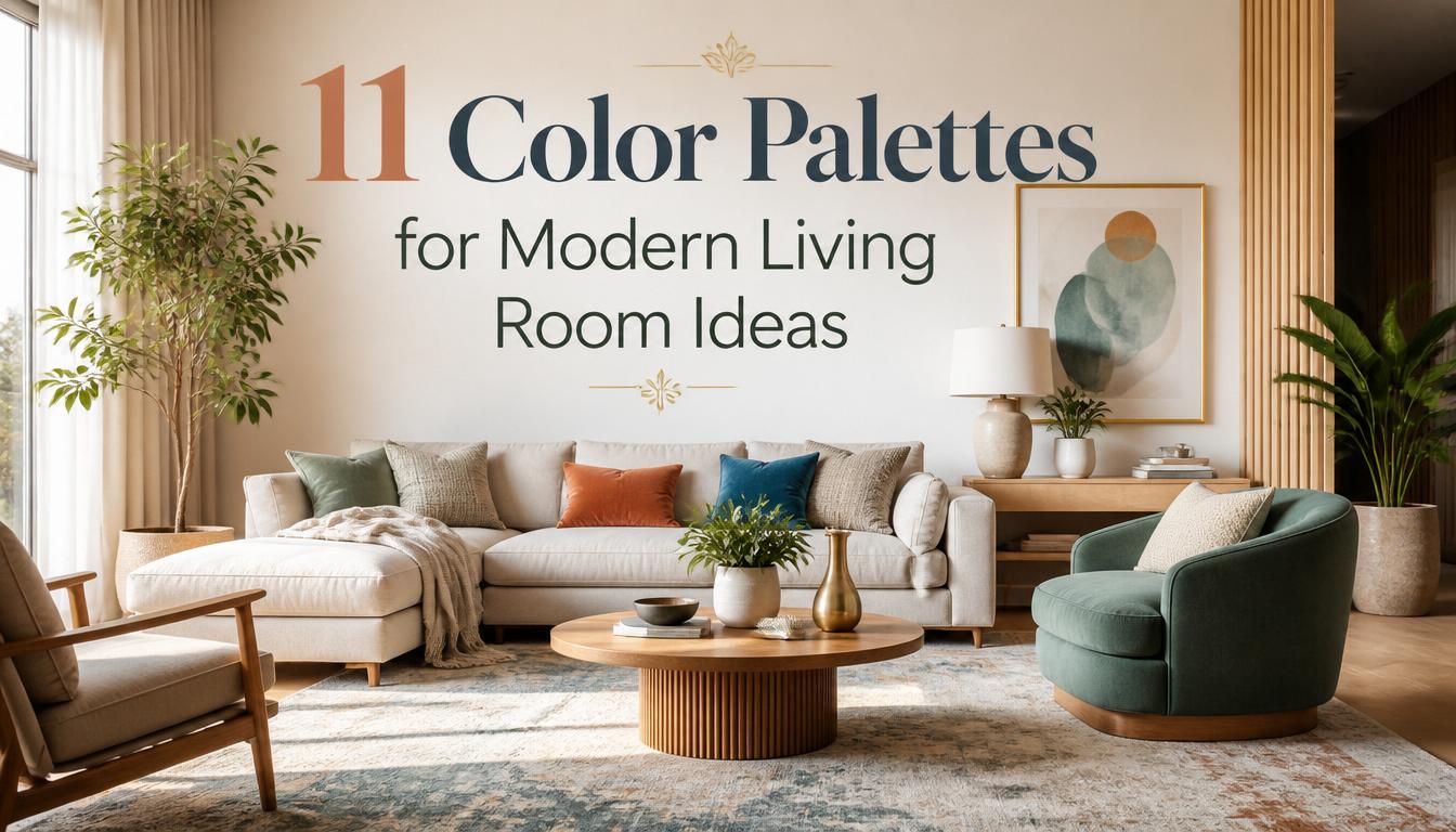
11 Color Palettes for Modern Living Room Ideas
Introduction
A modern living room should feel calm, stylish, and easy to live in. Color has a huge role in that feeling. The wrong palette can make a room feel cold, flat, busy, or unfinished, even when the furniture is beautiful. The right palette can make the same space feel polished, cozy, expensive, and more connected.
For many USA homes, the living room has to do a lot. It may be the family TV room, the formal sitting area, the weekend hosting spot, the reading corner, and the first room guests see. That is why choosing the right colors matters. These color palettes for modern living room styling are designed to help you build a space that feels fresh without losing warmth.
The best modern palettes are not only about wall paint. They include sofa fabric, rugs, curtains, wood tones, stone surfaces, metals, art, pillows, and lighting. A cream wall can look plain on its own, but paired with oak, black metal, linen, and warm brass, it suddenly feels intentional. A dark sofa can feel heavy alone, but with pale textiles and soft lighting, it becomes elegant.
Use these ideas as complete visual starting points. Each palette includes practical guidance, styling logic, materials, and real-life ways to make the room feel balanced. You can copy one palette closely or use it as inspiration for your own living room mood board.
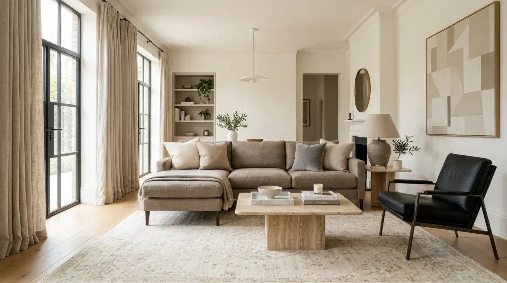
1. Warm Greige
- Creates a soft neutral base without feeling cold
- Works with linen sofas, oak tables, and cream curtains
- Makes small and medium living rooms feel calm
- Pairs well with black, brass, stone, and woven textures
Warm greige is perfect when you want a modern room that feels polished but still comfortable. It sits between gray and beige, so it avoids the cold feeling of flat gray while staying more refined than basic tan. In my experience, this palette works best with creamy walls, a greige sofa, oak furniture, black picture frames, and soft ivory textiles. The room feels quiet, but not empty. It gives you a flexible base for seasonal decor, art, greenery, and different metal finishes.
The key is layering enough texture so the neutral colors do not look dull. Use linen curtains, a wool rug, boucle pillows, a matte ceramic vase, and a wood coffee table to create depth. If the room feels too pale, add charcoal lamps or black accent chairs for structure. If it feels too dark, brighten it with cream throws and light artwork. This palette is practical for families because it hides daily wear better than bright white while still looking clean, modern, and easy to style.
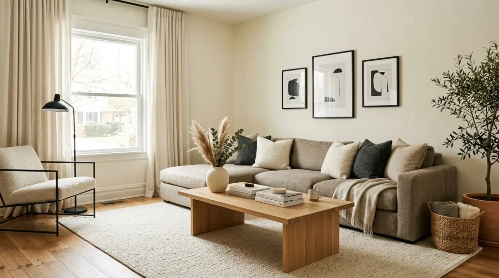
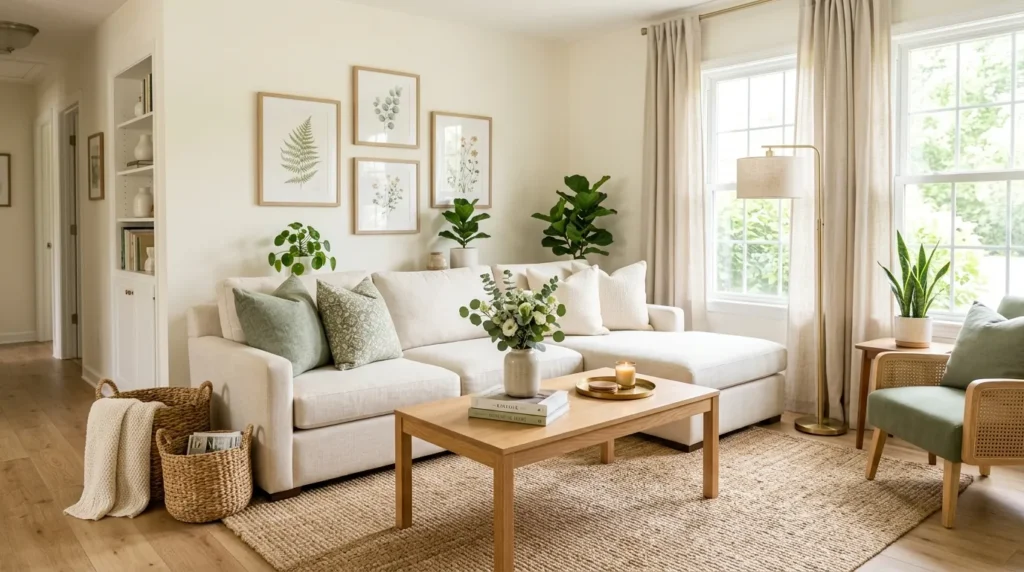
2. Soft Japandi
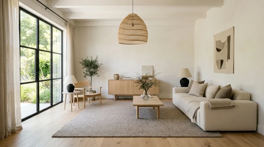
- Blends minimal modern style with natural warmth
- Works with light wood, cream walls, and low furniture
- Creates a peaceful, uncluttered living room mood
- Uses texture instead of bold pattern for interest
Soft Japandi is ideal for anyone who loves clean lines but does not want a room to feel stark. This palette usually combines warm white, pale beige, light oak, soft taupe, charcoal, and touches of muted green. The result feels calm, natural, and carefully edited. That’s why many designers recommend this style for open living areas where too much color can feel distracting. Choose low-profile furniture, simple shapes, and natural materials so the room feels balanced rather than overly decorated.
To make the palette feel livable, focus on comfort and spacing. A cream sofa, light wood coffee table, woven shade, textured rug, and black ceramic lamp can create a beautiful foundation. Keep accessories minimal, but make each one count. Use a handmade bowl, sculptural vase, linen pillow, or simple branch arrangement. Avoid shiny finishes and busy patterns because they fight the quiet mood. This approach works well in apartments, townhomes, and newer homes where you want softness without clutter or heavy traditional decor.
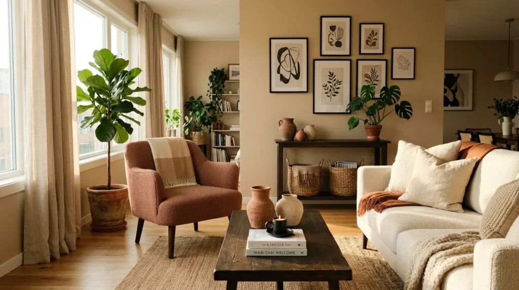
3. Black Cream
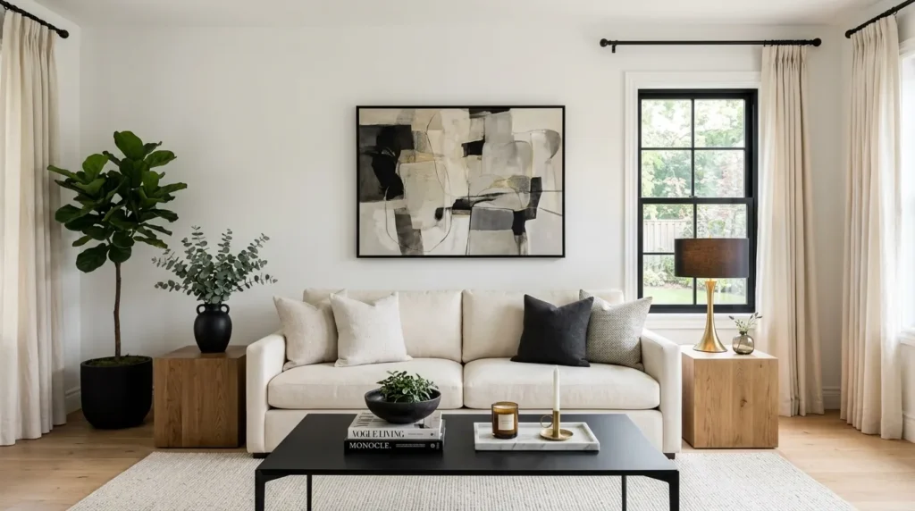
- Adds contrast while keeping the room elegant
- Works with white walls, black accents, and pale upholstery
- Makes modern furniture look sharper and more intentional
- Pairs well with marble, oak, brass, and textured fabrics
Black and cream is a strong modern palette because it creates contrast without needing loud color. Cream walls or upholstery keep the room soft, while black frames, lamps, tables, or shelving add definition. I’ve noticed this palette works especially well in living rooms with simple architecture because the black accents create visual structure. The room instantly feels more designed. Use black in controlled places, such as curtain rods, side tables, artwork frames, fireplace details, or a sleek media console.
The best version of this palette includes warmth, so it does not feel too graphic or harsh. Add natural oak, woven baskets, soft rugs, stone accessories, and warm lighting to balance the contrast. A cream sofa with black pillows can look beautiful, but add texture through boucle, cotton, velvet, or linen. If you have kids or pets, choose performance fabric in ivory or oatmeal instead of pure white. The finished living room feels crisp, modern, and expensive while still being comfortable for everyday use.
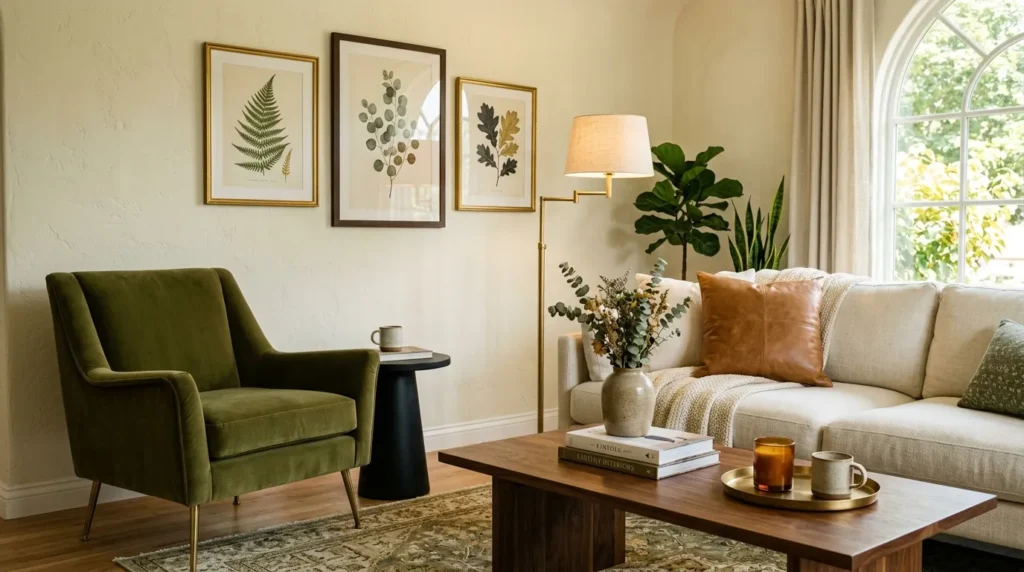
4. Sage Oak
- Brings natural color into a modern space
- Works with oak furniture, white walls, and soft green accents
- Adds calm without making the room feel dark
- Pairs beautifully with brass, rattan, linen, and stone
Sage and oak create a living room that feels fresh, grounded, and easy to live with. Sage green adds gentle color without taking over the room, while oak keeps everything warm and natural. This palette works beautifully in American homes with wood floors, neutral walls, or open kitchen-living layouts. In my experience, sage looks best when used through textiles, art, cabinets, or an accent chair instead of covering every surface. It gives the room character while keeping the mood soft.
To style this palette well, repeat sage in small but visible ways. Try pillows, a throw, a ceramic lamp, a patterned rug, or botanical artwork. Pair it with light oak tables, cream upholstery, woven baskets, and warm brass accents. If your room already has darker wood, choose a slightly deeper sage so the colors feel balanced. Add white or oatmeal curtains to keep the space bright. This palette feels modern but not trendy, making it a smart choice for homeowners who want calm color with long-term appeal.
5. Clay Blush
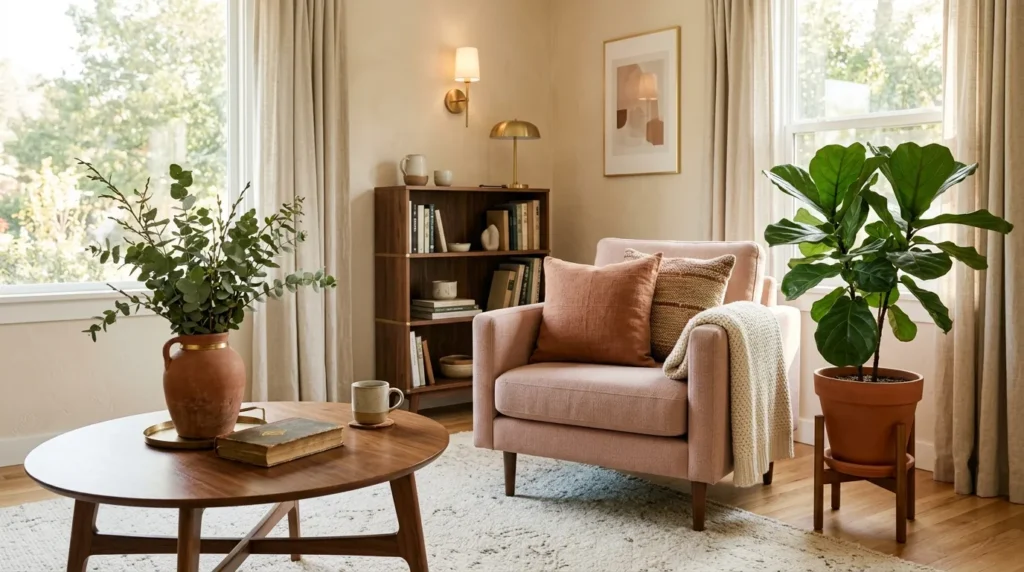
- Adds warmth, softness, and subtle color
- Works with terracotta, blush, beige, cream, and walnut
- Makes neutral rooms feel more personal
- Pairs well with linen, velvet, ceramics, and warm metals
Clay and blush create a modern living room that feels warm, soft, and slightly artistic. The palette is built around muted pink, terracotta, warm beige, cream, and natural brown. It feels more grown-up than pastel pink because the clay tones add earthiness. I’ve seen this work well in many homes where plain beige feels too safe but bold color feels too risky. A blush chair, clay pillows, warm wood table, and cream rug can completely change the room’s mood.
Keep the palette sophisticated by using dusty, muted shades instead of bright pink or orange. A terracotta vase, pale rose artwork, walnut side table, and beige sofa can create a beautiful balance. Add brass or bronze accents if the room needs glow, and choose matte ceramics for texture. This palette also works well with plants because green naturally balances warm pink tones. The result feels inviting, stylish, and personal without becoming overly feminine or too themed for a shared living space.
6. Navy Camel
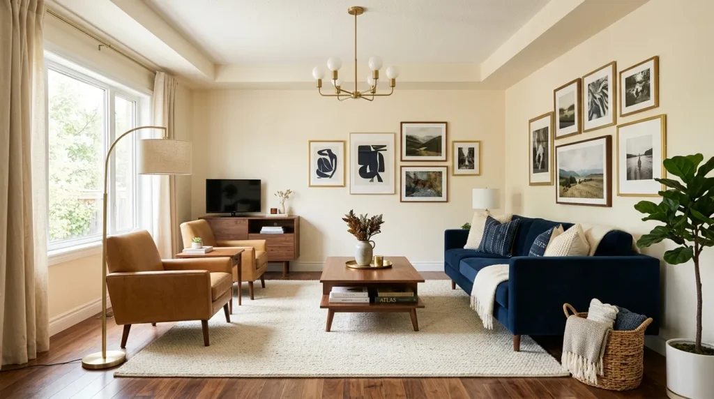
- Creates a rich modern look with classic contrast
- Works with leather, navy upholstery, cream walls, and wood
- Adds depth without making the room feel too dark
- Pairs well with brass, walnut, plaid, and textured rugs
Navy and camel make a living room feel tailored, grounded, and quietly luxurious. Navy brings depth, while camel adds warmth through leather, wood, pillows, or upholstery. This palette works especially well in homes with white trim, wood floors, fireplaces, or built-in shelving. That’s why many designers use navy when they want color that still feels timeless. A navy sofa with camel leather chairs can look polished, while a camel sofa with navy pillows feels softer and easier to update.
Balance is important because both colors have strong presence. Use cream walls, ivory curtains, or a pale rug to keep the room from feeling heavy. Add brass lighting for warmth and walnut furniture for depth. If you want a more casual feel, include woven baskets or a faded vintage rug. If you want a sharper look, choose black frames and clean-lined tables. This palette works beautifully for family rooms, media rooms, and formal living spaces because it feels comfortable, durable, and refined.
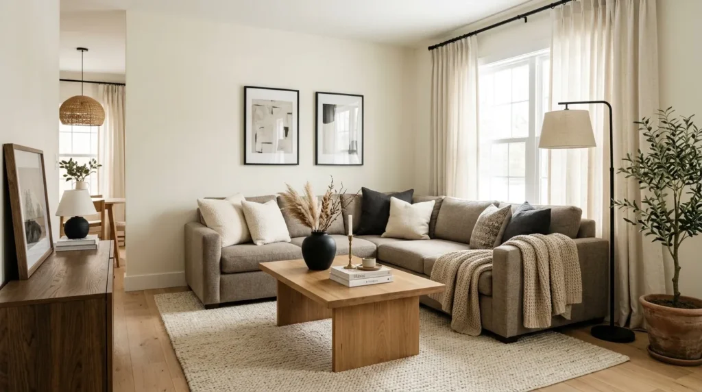
7. Charcoal Linen
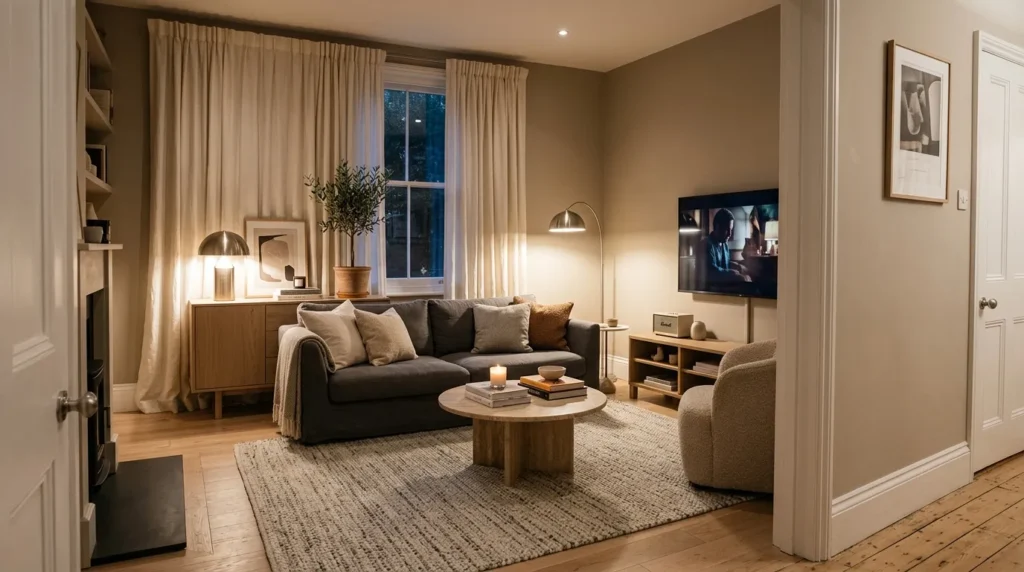
- Gives the room depth without using harsh black
- Works with linen sofas, gray walls, and cream accents
- Creates a calm, mature modern style
- Pairs well with stone, oak, nickel, and wool rugs
Charcoal and linen create a soft modern palette with depth, texture, and quiet contrast. Charcoal is less severe than black, while linen tones keep the room light enough for everyday comfort. In my experience, this palette is especially useful for TV rooms because darker accents help ground electronics and media consoles. Use charcoal through a sofa, rug, fireplace surround, or accent wall, then soften it with cream curtains, oatmeal pillows, pale wood, and warm lamps.
The room should feel layered, not gray from top to bottom. Mix smooth and rough materials so the palette feels intentional. Try a linen sofa, wool rug, stone coffee table, brushed nickel lamp, and oak sideboard. If the space has low natural light, keep the walls light and use charcoal in furniture only. If the room is bright, a charcoal wall can feel dramatic and cozy. This palette gives modern living rooms a calm, grown-up look without feeling cold or overly formal.
8. Olive Brass
- Adds earthy color with a polished finish
- Works with olive accents, brass lighting, cream walls, and wood
- Creates warmth without using bright colors
- Pairs well with leather, velvet, stone, and botanical art
Olive and brass create a living room that feels earthy, elegant, and welcoming. Olive green has more depth than sage, so it works well when you want color that feels mature. Brass adds glow and keeps the palette from feeling too muted. I’ve noticed this combination looks especially beautiful in rooms with warm wood floors, cream walls, and leather seating. Use olive through curtains, pillows, an accent chair, art, or a painted cabinet rather than overwhelming the room.
To keep the palette modern, use clean furniture shapes and avoid too many rustic pieces. A cream sofa, olive velvet chair, brass floor lamp, black side table, and walnut coffee table can feel balanced and current. Add stone accessories or ceramic vases to ground the shine of the brass. If your room feels too dark, bring in ivory textiles and lighter artwork. This palette works well year-round because it feels cozy in fall and winter but still natural and fresh in spring.
9. Taupe Stone
- Creates a refined neutral room with soft depth
- Works with stone tables, taupe upholstery, and cream walls
- Makes the space feel calm, mature, and expensive
- Pairs well with travertine, wool, linen, and black accents
Taupe and stone create a refined modern living room that feels calm without looking plain. Taupe has more depth than beige and more warmth than gray, which makes it flexible for different homes. Pair it with travertine, marble, limestone, warm white walls, and textured fabrics for a quiet luxury mood. In my experience, this palette looks best when the main furniture stays simple and the materials do the visual work. It feels polished without needing bright color or dramatic pattern.
Use stone elements carefully so the room does not feel heavy. A travertine coffee table, marble tray, ceramic lamp, or limestone fireplace detail can add elegance in small doses. Balance those harder surfaces with soft wool rugs, linen curtains, and cushioned seating. Black accents help define the room, while brass or bronze adds warmth. This palette is ideal for homeowners who want a modern living room that feels expensive, calm, and timeless. It also photographs beautifully because the textures show clearly in natural light.
10. Cocoa White
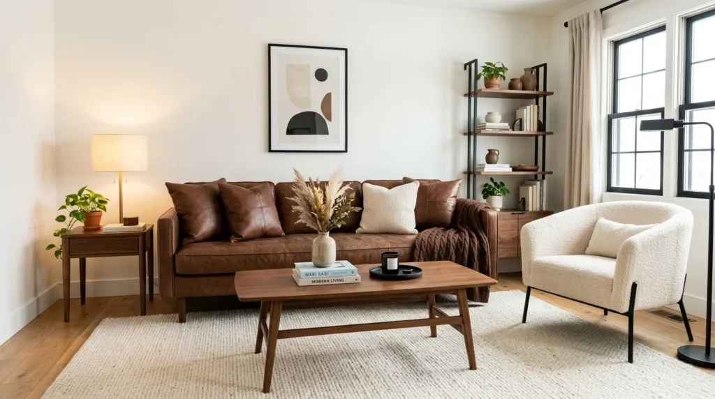
- Adds warmth to a clean modern room
- Works with chocolate brown, warm white, cream, and oak
- Makes the room feel cozy without looking dated
- Pairs well with boucle, leather, walnut, and soft lighting
Cocoa and white feel fresh when the brown is deep, warm, and used with intention. This palette is a modern answer to older brown living rooms that felt heavy or dated. Warm white walls, cocoa pillows, brown leather, walnut tables, and cream upholstery create a rich but airy mood. I’ve seen this work well in homes where people want comfort but still prefer a clean, updated look. The brown adds depth, while the white keeps everything bright.
The key is choosing brown tones that feel smooth and rich, not muddy. Look for chocolate leather, espresso wood, cocoa velvet, or warm walnut. Pair them with cream rugs, boucle chairs, white walls, and soft lamps. Avoid too many orange-brown pieces unless the room has enough pale balance. Add black accents for modern structure or brass for warmth. This palette is practical for busy households because darker brown details hide wear, while the white foundation keeps the room looking fresh and spacious.
11. Moody Terracotta
- Adds bold warmth without using bright red or orange
- Works with cream walls, rust textiles, dark wood, and black accents
- Creates a cozy modern living room with personality
- Pairs well with clay, leather, woven textures, and greenery
Moody terracotta brings warmth, personality, and depth into a modern living room without feeling loud. It works best when the color is muted, earthy, and balanced with cream, black, dark wood, and natural textures. Use terracotta through pillows, rugs, artwork, pottery, or an accent chair. If you love bolder rooms, a clay-toned accent wall can look stunning. This palette feels especially inviting in homes with good natural light, wood floors, and simple furniture shapes.
To keep the room from feeling too warm, add contrast through black frames, cream upholstery, green plants, or pale curtains. Woven baskets, leather chairs, clay vases, and textured rugs all support the color story. If the space is small, use terracotta in smaller doses so it adds character without shrinking the room. This palette is perfect for anyone who wants a modern living room that feels cozy, artistic, and memorable. It gives the space a strong Pinterest look while still feeling livable.