
10 Pink Accent Walls and Bold Bedroom Ideas
Introduction
Pink can completely change a bedroom when it is used with confidence and balance. It can feel soft, dramatic, romantic, modern, playful, or grown-up depending on the shade, finish, furniture, and lighting around it. Many USA homeowners and renters are moving away from plain neutral bedrooms and looking for color choices that still feel stylish, personal, and livable.
The best pink bedroom ideas are not only about painting one wall. They are about creating a full design story. A dusty rose wall with linen bedding feels calm. A hot pink headboard wall with black furniture feels energetic. A blush plaster wall with brass lights feels boutique-hotel inspired. For readers searching for pink accent walls and bold bedroom inspiration, the key is choosing a shade that fits the room’s size, natural light, and personality.
These ideas are made for real bedrooms, apartments, teen rooms, guest rooms, and primary suites. Each section includes practical styling tips, materials, color pairings, and layout advice so the finished room feels intentional instead of overwhelming.
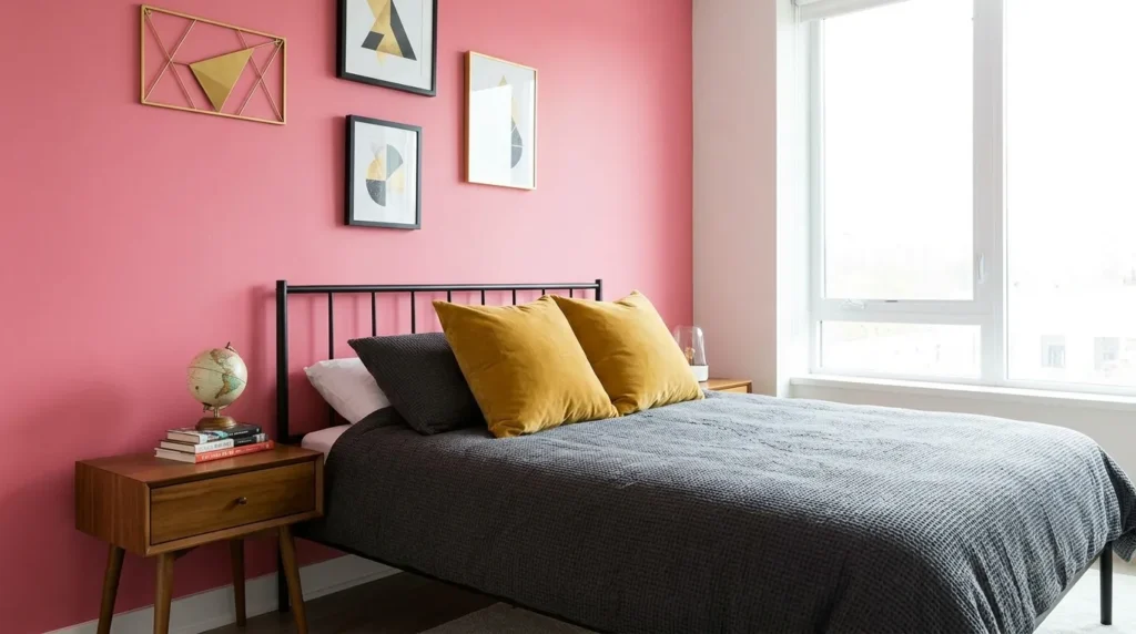
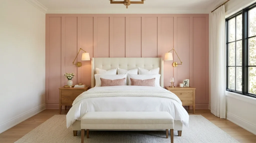
1. Dusty Rose
- Creates a soft color moment without feeling too sweet
- Works with cream bedding, oak furniture, and brass lighting
- Makes bedrooms feel warm, calm, and grown-up
- Pairs well with linen, boucle, wool, and natural wood
Dusty rose is the easiest pink shade to live with because it feels muted, warm, and mature. It gives the bedroom color without creating a loud or overly playful mood. In my experience, this shade works best behind the bed because it frames the main sleeping area and gives the room a clear focal point. Pair it with warm white walls, oak nightstands, cream bedding, and brass sconces to keep the look soft. The color feels romantic, but still clean enough for a modern home.
The transformation becomes stronger when every surrounding detail feels calm and textured. Use washed linen sheets, a wool rug, a ceramic lamp, and simple art in beige, cream, or charcoal. If the room gets bright afternoon sun, test samples first because dusty rose can shift warmer during the day. For smaller bedrooms, keep the other walls light so the space does not feel closed in. The finished room feels cozy, elegant, and Pinterest-ready while still being easy to sleep in every night.
2. Hot Pink
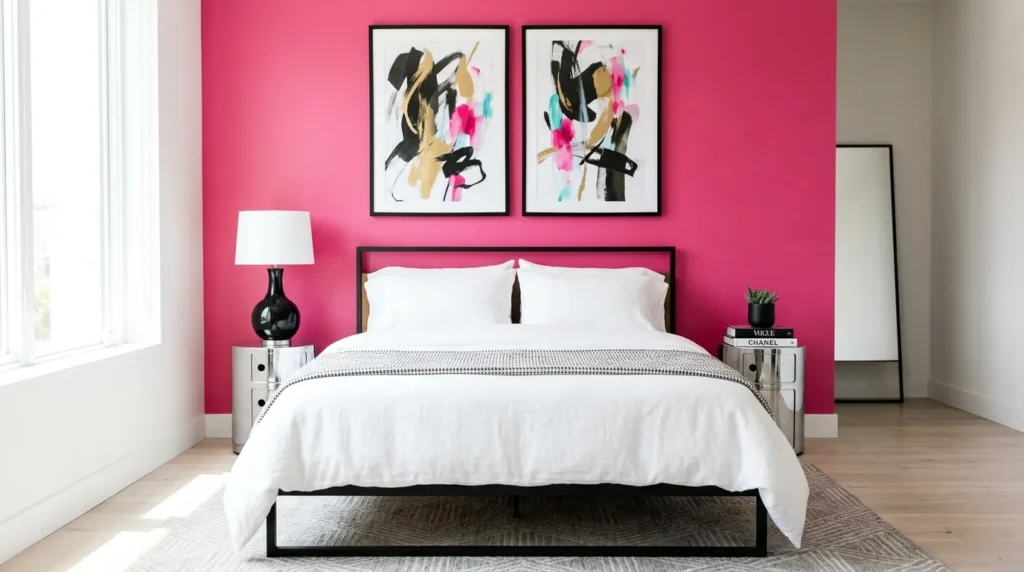
- Adds high-energy drama to a bedroom
- Works well behind beds, vanities, or creative corners
- Pairs with black, white, chrome, acrylic, or deep navy
- Best when balanced with clean furniture and simple bedding
Hot pink is for bedrooms that want personality from the moment you walk in. This color is confident, playful, and visually strong, so it works best when used with control. A single wall behind the bed, a painted arch, or a framed panel can create the impact without overpowering the entire room. That’s why many designers recommend pairing bright shades with crisp shapes. Black lamps, white bedding, chrome accents, and clean-lined furniture help the color feel intentional instead of chaotic.
The key is editing everything around the wall so the room still feels stylish. Avoid too many competing patterns, and let the pink be the main event. A white duvet, black metal bed, glossy side table, and modern art can give the room a fashion-inspired look. For teen bedrooms or creative guest rooms, add one repeating accent like pink piping, a throw pillow, or a small rug detail. The final result feels bold, fun, and polished without becoming visually exhausting.
3. Blush Plaster
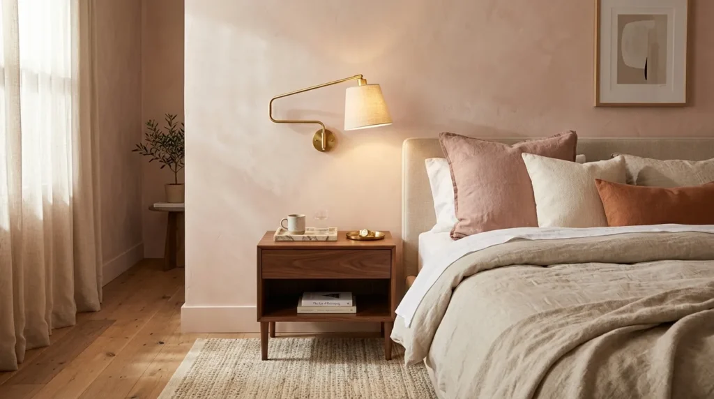
- Gives pink walls a soft boutique-hotel texture
- Works with limewash, Roman clay, plaster, or matte paint
- Adds depth without using strong pattern
- Pairs beautifully with brass, marble, walnut, and linen
Blush plaster creates a soft, layered look that feels more expensive than flat paint. The texture catches light in gentle ways, making the wall feel warm and dimensional throughout the day. This is a beautiful choice for primary bedrooms because it feels calm but still special. Limewash, Roman clay, Venetian plaster, or textured matte finishes can all create a similar effect. I’ve noticed this works especially well when the bedding and furniture stay simple, letting the wall finish become the quiet luxury detail.
To style it well, choose materials that feel natural and refined. Linen bedding, a walnut nightstand, brass reading lights, and a marble tray can make the room feel polished without clutter. Keep artwork minimal, or use one large framed piece so the texture remains visible. If a real plaster finish is outside your budget, try a high-quality matte paint in a blush tone and layer it with soft lighting. The room will feel warmer, more custom, and more relaxed than a standard painted bedroom.
4. Coral Pop
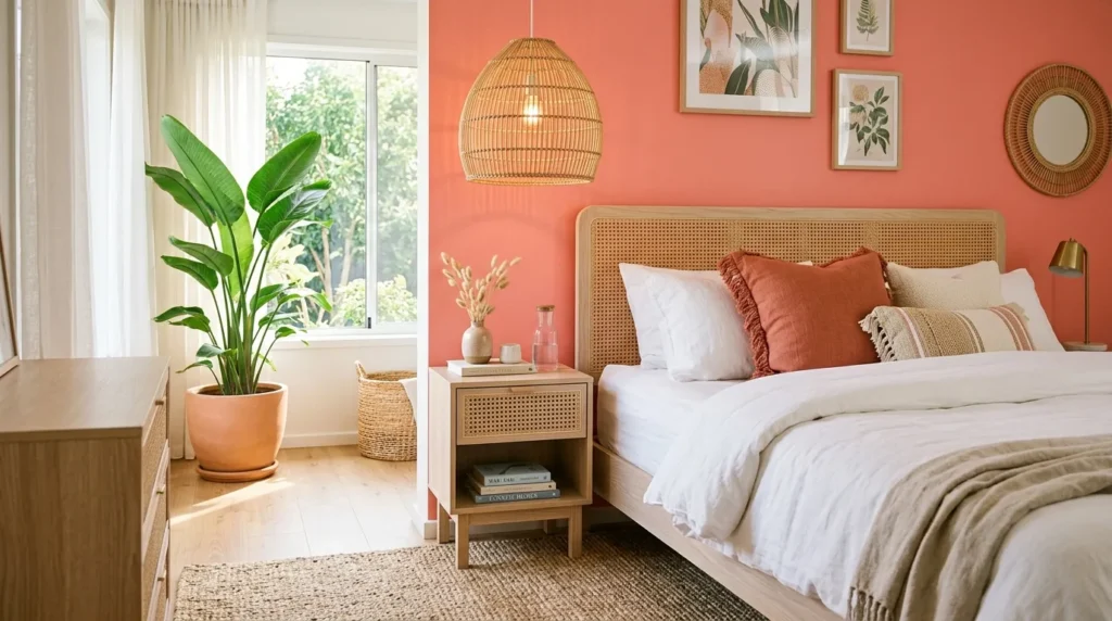
- Adds warmth and energy without using neon color
- Works with rattan, white bedding, terracotta, and light wood
- Brightens guest rooms, beachy bedrooms, and small spaces
- Pairs well with greenery and woven decor
Coral pink brings sunshine into a bedroom because it sits between pink and orange. It feels cheerful, warm, and lively without becoming harsh when the shade is softened. This color works especially well in coastal homes, guest bedrooms, and bright apartments where natural light supports warmer tones. Use it on the wall behind the bed, inside a niche, or as a half-wall with white above. In my experience, coral looks best when surrounded by natural textures like rattan, cane, cotton, and pale wood.
The finished space should feel fresh instead of tropical-theme heavy. Keep bedding mostly white or cream, then repeat coral through one pillow, a small print, or a patterned rug. Green plants balance the warmth beautifully, while woven lamps add softness. If the room feels too bright, add tan, oatmeal, or clay accents to ground it. Coral can make a plain bedroom feel welcoming and alive, especially when used with simple furniture and plenty of breathable space around the bed.
5. Mauve Drama
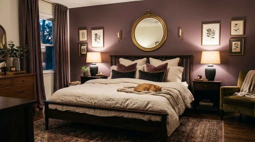
- Creates a moody pink-purple bedroom look
- Works with velvet, dark wood, brass, and charcoal
- Adds depth while still feeling soft and feminine
- Great for adult bedrooms, guest rooms, and evening spaces
Mauve is perfect when you want pink with more depth and maturity. It has a soft purple undertone that makes the bedroom feel moody, calm, and slightly dramatic. This shade works beautifully on an accent wall behind a dark wood bed, upholstered headboard, or brass-framed mirror. Many designers recommend mauve for bedrooms because it feels restful at night while still offering color during the day. It is softer than burgundy, deeper than blush, and more grown-up than pastel pink.
To make mauve feel modern, pair it with texture and contrast. Try cream bedding, velvet pillows, charcoal lamps, walnut nightstands, and warm brass hardware. A faded vintage rug with hints of mauve, taupe, and ivory can tie the palette together beautifully. If the room has low natural light, choose a lighter mauve so the space does not feel heavy. The final look feels intimate and layered, making the bedroom feel like a cozy retreat rather than a plain sleeping space.
6. Pink Arch
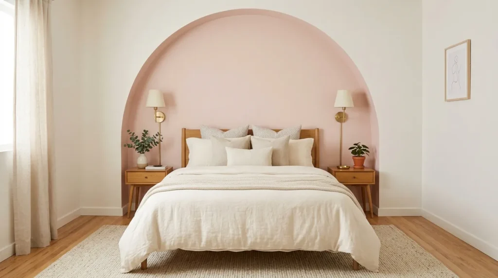
- Adds shape and color without painting the full wall
- Works behind beds, desks, dressers, or reading corners
- Great for renters using removable paint or peel-and-stick decals
- Creates a custom look on a small budget
A painted pink arch gives a bedroom architectural interest even when the room has basic walls. It can frame a bed, vanity, desk, dresser, or reading chair without requiring molding or construction. This idea is especially helpful in rentals, apartments, and small bedrooms because it adds personality without covering every surface. Use a soft blush for a calm look, rose for warmth, or brighter pink for a playful statement. The curved shape softens square furniture and makes the wall feel more designed.
Measure carefully before painting so the arch looks balanced with the furniture below it. Use painter’s tape for the sides and a pencil-string method or flexible curve tool for the top. Keep the furniture centered inside the shape, then add a lamp, art, or mirror to complete the vignette. If painting is not allowed, use removable wall decals or peel-and-stick panels. The finished effect feels charming, budget-friendly, and visually strong, giving the room a custom detail without a major renovation.
7. Berry Contrast
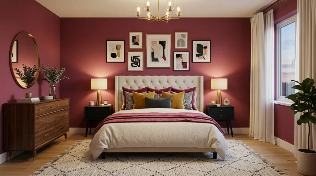
- Creates a rich and modern bedroom palette
- Works with cream, black, walnut, burgundy, and brass
- Adds depth without using traditional red
- Makes the bed wall feel dramatic and stylish
Berry pink feels rich, bold, and modern when paired with the right neutrals. It has more depth than bright pink and more warmth than purple, making it a beautiful choice for adult bedrooms. Use it behind the bed with cream bedding, black side tables, walnut furniture, and brass lighting for a polished look. I’ve seen this work well in many homes because berry tones create drama without feeling childish. The color feels confident but still cozy enough for a sleeping space.
To keep the room balanced, let the berry shade be the strongest color and keep everything else controlled. A cream rug, ivory curtains, and simple bedding will soften the mood. Add one darker accent through black lamps, framed art, or a charcoal throw. If you want more richness, include velvet pillows or a burgundy patterned rug. This palette works especially well in rooms with evening lighting because warm lamps make the wall glow. The result feels stylish, grown-up, and memorable.
8. Panel Detail
- Adds texture and structure to a pink wall
- Works with board and batten, picture molding, or fluted panels
- Makes color feel more architectural
- Great for bedrooms that need depth without busy decor
Paneling makes a pink wall feel more custom because it adds shadow, shape, and structure. Board and batten, picture-frame molding, fluted panels, or simple vertical trim can turn a flat wall into a feature. Paint the entire treatment one pink shade for a clean modern look, or keep the trim slightly lighter for subtle contrast. In my experience, paneled walls work best behind the bed because they create the feeling of a built-in headboard and make the room look more finished.
Plan the panel layout around the bed width, nightstands, outlets, and light fixtures before installing anything. Balanced spacing matters because uneven panels can make the room feel off. Use smooth paintable trim, caulk the seams, and choose a durable finish that can handle dusting. Soft rose looks elegant with picture molding, while deeper pink feels striking with vertical battens. Add simple bedding and wall lights so the panel detail remains the star. This idea gives the bedroom depth, style, and a high-end custom feel.
9. Two-Tone Wall
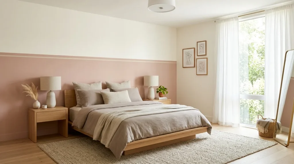
- Adds color while keeping the room visually balanced
- Works with pink and white, pink and taupe, or pink and charcoal
- Helps low ceilings feel taller when placed carefully
- Great for modern, teen, guest, or apartment bedrooms
A two-tone wall is a smart way to use pink without letting it dominate the room. Paint the lower half in a rose, blush, or berry tone, then keep the upper half white, cream, or taupe. This creates color at furniture level while keeping the room bright above. It works especially well in small bedrooms because the lighter top section helps the ceiling feel more open. That’s why many designers recommend half-painted walls for rooms that need color and balance at the same time.
For a clean finish, use painter’s tape, a level, and careful measuring before painting. Add a slim chair rail or painted line if you want a more polished edge. Place the color break slightly below the headboard height for a grounded look, or higher for more drama. Pair the wall with simple bedding, matching lamps, and a rug that repeats both tones. The finished bedroom feels graphic, modern, and easy to update later if your style changes.
10. Floral Focus
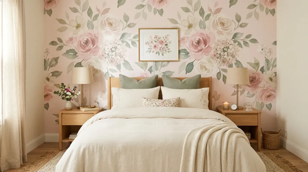
- Adds romance and pattern to a bedroom wall
- Works with wallpaper, murals, decals, or painted florals
- Pairs with simple bedding and understated furniture
- Creates a strong Pinterest-style focal point
A floral pink wall can feel fresh and modern when the pattern is chosen carefully. Oversized florals, watercolor blooms, vintage-inspired prints, or peel-and-stick murals can turn the bed wall into a true design feature. The trick is keeping the rest of the room quieter. Plain bedding, simple nightstands, and soft lighting let the floral wall feel special without making the bedroom too busy. This idea works beautifully for guest rooms, teen bedrooms, cottage-style spaces, and romantic primary suites.
Choose the floral scale based on room size. Large prints can make a small wall feel intentional, while tiny patterns may look busy from across the room. If you rent, removable wallpaper or decals give you flexibility. Pull two colors from the print for bedding and accessories, such as cream and sage or blush and taupe. Avoid adding too many extra patterns unless they are subtle. The final room feels layered, pretty, and personal while still being comfortable enough for daily life.